top of page
Lumma
Lumma Cups wanted to introduce their menstrual cups to an international market. They were facing multiple issues such as branding inconsistency, lack of sales and awareness, insufficient user flow and the need to launch new products into the global market.
The brand needed a complete redesign which included brand identity, user experience, visual design, content production and marketing.
Brand Identity
Art Direction
Content Production

Before

After

Starting with the logo, I created a simplified and elegant wordmark of the word Lumma. For a more feminine, soft look I opted for a pastel color palette of aqua, pale orange, salmon pink and a deep wine red for the main brand color.


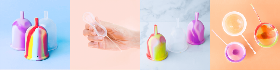


Extending the feminine, soft palette of Lumma, I created a variety of content for their social channels with a mix of illustrations, photography, and motion graphics. The simple linear illustrations are created throughout the content to drive visual consistency and personify the brand.


bottom of page